A lot of businesses think that data analysis has to involve complicated algorithms that only highly-trained data scientists can understand. The truth is, you can use the data your business holds to add enormous value just by using some fairly simple statistical concepts and an Excel spreadsheet. This blog focuses on Key Driver Analysis.
What is Key Driver Analysis?
Key Driver Analysis helps businesses identify what is really driving their sales or their customer loyalty or any other metric which is important to business growth.
Often it is used to analyse customer satisfaction surveys to work out what is most important to customers, and therefore where the company needs to invest most of its time and attention.
If a business runs a customer satisfaction survey and gets low scores in one particular area, the obvious conclusion is that managers should immediately work on improving that score. But what if that particular metric doesn’t actually have much impact? Are there are other metrics which will have a greater effect on improving your business?
Introduction to Linear Regression
Key Driver Analysis relies on a statistical technique called linear regression. Regression tries to find out whether there is a relationship between two variables, and if there is a relationship, what that relationship is.
Imagine we want to look at sales from an ice cream van. This is a graph plotting the number of ice creams sold per day, against the average temperature on each day. Just from looking at the graph we can see there is a strong relationship between temperature and sales.
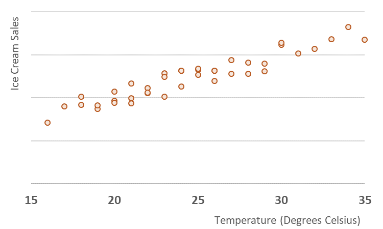
We can get Excel to draw a line (known as the “line of best fit”) through the middle of those data points, and automatically works out where the line should be by using the “least squares” method.
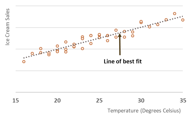
But even though there is obviously a strong link between ice cream sales and temperature, the weather doesn’t explain everything about how much ice cream is sold, because not every data point sits exactly on the line. There are several days where the temperature was exactly the same, but slightly different amounts of ice cream were sold. There could be lots of reasons for this – for example an unusually high sales day might be because an event going on nearby which meant that lots of people happened to be passing the ice cream van.
Excel can therefore also work out what percentage of the sales figure can be explained by the temperature and what percentage is explained by something else. This is known as the R2 value (R-squared) which in this case is 0.89, meaning that 89% of the ice cream sales figures are dependent on the temperature that day.
The other important task that Excel can carry out, is to work out exactly what the relationship is between sales and temperature expressed as a formula:
What this allows us to do is to predict the number of ice creams that will be sold, if we know what the temperature is that day. In this formula, x is the temperature and y is the predicted sales. If the temperature is 25 degrees, we would expect to see sales of (10.19 x 25) – 3.46. This comes to 251.
How do we use linear regression in Key Driver Analysis?
So let’s imagine we are looking at some data from a restaurant which runs a delivery service. They ask their customers to fill in a survey which asks to give a 1-10 rating score on how they found the Speed, Quality and Customer Service and then asks them to say how likely they would be to recommend the company (a Net Promoter Score or NPS) which is generally recognised as a key driver of growth. For this business the NPS is fairly low and the managers want to know what they should be focusing on in order to fix the problem.
The raw data comes in a table like this, shown with the average scores for each question.
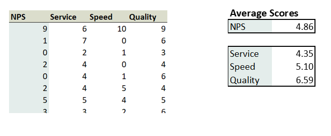
On the face of it, Customer Service scores the lowest and you could conclude that the company should concentrate on fixing this first. But let’s look at the relationships between each of these areas and the NPS score.
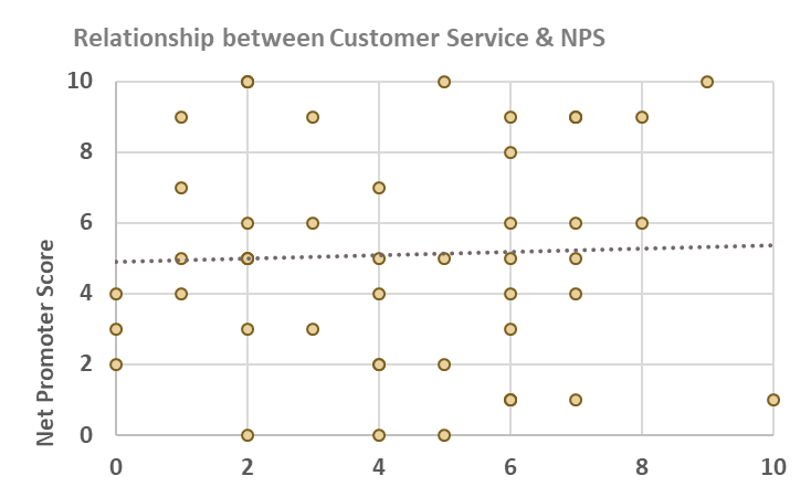
This graph shows that in fact there is very little relationship between a customer giving a high Customer Service score and giving a high NPS score. The R2 value is 0.001 meaning that only 0.1% of the changes in the NPS score can be attributed to changes in the Customer Service score.
When we look at the relationships between Speed and NPS, and Quality and NPS, the correlation is much stronger.
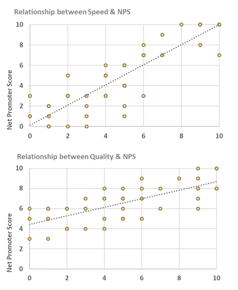
But out of the two scores what is the most important area to focus on? To work this out we need to look at the equations for the line of best fit.
Speed

Quality
The numbers highlighted in red (known as the beta value) determine the slope of the line. The higher the number, the steeper the slope and we can visually see that the Speed graph has a steeper slope than the Quality graph.
A steep slope means that changing the score in this area will have a big impact. For every one point increase in the Speed score, the NPS score increases by 0.98. But a one point increase in Quality only leads to an NPS increase of 0.42. So this suggests that the very first priority for this business should be to get the Speed of its deliveries up as this will have the greatest impact on its NPS score.
We can map the values in a matrix showing what action needs to be taken.
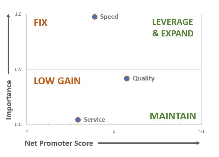
For scores which are low and which are important, it is clearly a priority to fix them as soon as possible, but scores which are low and which are less important, have lower gains associated with them. High scores with high importance can be expanded to gain greater traction with customers, but there is little point in investing in areas which already have high scores but which are not influencing customer outcomes.
Key Driver Analysis can be used to look at a wide variety of metrics
Key Driver Analysis can be used in all sorts of ways – for example to assess what factors drive a propensity to buy a product, or to understand what factors cause customers to have a positive or a negative impression of your brand. Another common use is to look at what drives “usability”, where customers fill in a questionnaire about how easy a product or app is to use.
This technique could potentially be used to find the key drivers behind any number your business is interested in. For example if you have granular level customer data you might want to use survey data in conjunction with actual sales figures and work out which aspect of your business was driving customers to purchase more. If you have demographic data for your customers such as age, income or gender you could find out whether these were related to sales levels. The data doesn’t even necessarily have to relate to individual customers if you have a chain of stores you could work out what was the principle driver of sales in those stores – size, range or customer satisfaction scores.
Pitfalls in using regression
However, there are a number of watch outs when using linear regression techniques.
One is that regression simply establishes correlation rather than causation. In the ice cream example, we could plot the sales of ice creams against the sales of sun hats and would probably find a strong link. But that doesn’t mean that if you invested in encouraging more people to buy ice creams then you would see the sales of sun hats increase – the actual causal link is that on hot days people are more likely to buy both items.
There are other situations where two variables are closely linked, known as “multicollinearity” – for example if a survey asks two very similar questions such as “Were the staff friendly?” and “Were the staff helpful?” This can lead to difficulty in interpreting the model, but it can be dealt by further analysing the data and taking the least important variable out.
Another problem is that quite strong correlations can be thrown up between two variables, purely by chance. This is a particular problem with machine learning algorithms which trawl through large data sets trying to find links between different fields – see my blog on Big Data for more about this issue.
As with all data analysis the way to avoid problems is to plan properly in advance with input from both the person doing the analysis (who can for example advise on how to structure a survey to avoid multicollinearity problems) and managers who understand the business well, and who will know which correlations are useful and which ones are not.
Overall, when used properly Key Driver Analysis is an extremely useful tool in identifying which areas a business should invest in, and one which doesn’t rely on complicated and expensive analytics. For more ideas about how to use statistical analysis to help your business click here.
Get in touch
If you believe that evidence-based decision making is driven through collaboration between analysts and business managers then contact us to talk about how your business uses data, and find out whether there is a fit between your needs and the services Sensible Analytics can offer.
