Why Customer segmentation is essential for your business

Customer segmentation is a powerful tool to help businesses focus their efforts on the right people and serve customers better. A customer segment is a grouping of customers that share certain characteristics; they help you understand how customers differ and how you can adapt to the differences.

What are the benefits of segmenting customers?

    Identifying your most profitable customers. Businesses will want to identify the groups of customers who are the most likely to spend money with them. It will be worth spending more money to acquire or retain customers who belong to these segments versus those in less profitable groups.

    On the other hand it can also identify groups of customers which aren’t engaging with your business as well as you’d hoped. If you understand the characteristics of those customers, you can develop a strategy to target them.

    Tailoring marketing campaigns. In the past all customers would be exposed to the same marketing materials, whether through advertising in print media, leaflets, billboards or broadcast media. A business only had to identify characteristics which most of their target audience shared and blast the same message out at them whilst accepting the fact that many potential customers might be put off.

    The great power of digital and social media advertising is that different customers can see messages specifically tailored towards them. Dividing your customers into meaningful segments is essential to take advantage of this.

    Customising products or service features for different groups. Just as marketing can be tailored to different audiences, some products and services can also be customised to different customers.

    Predicting future purchase patterns or behaviour. Finding out how different segments are likely to behave is useful for a number of reasons.

    It can help identify and target individual customers who are behaving unusually in relation to their segment, so for example one group of customers might tend to purchase every week, whereas another might purchase every month. If a customer from the first group hasn’t bought anything for two weeks then this would be flagged as unusual and might trigger a special offer being sent to them. But for customers in the second group, not purchasing for a fortnight would be perfectly normal behaviour and not trigger any special action.

    It can also be used to recommend products – if one segment tends to purchase a lot of a particular product, you can identify customers who don’t currently purchase that product and offer them a recommendation.

How to segment your customers

Segmenting by Demographics

There are lots of different ways of dividing up customers. If you have access to demographic data about your customers then dividing them into groups based on this data is an obvious way to segment them. Demographic data usually consists of variables such as gender, age, income, education, occupation and number of children.

Businesses will almost always have data on where customers live or where their business is based (if they are in the B2B market). There is a huge amount of official government data about the characteristics of different geographical areas which can help inform a business about the sorts of customers who are likely to live there.

Segmenting by Behaviour

The other way to divide customers is not by who they are, but by what they do. This can include an analysis of their transactions with the business, but also factors such as when they shop (is it at a particular time of year or time of day), what channels do they use to shop (online or in store), what type of products do they buy, do they have a loyalty card, and any information about social media activity that your business holds.

Segmentation by RFM

RFM (recency, frequency, monetary) analysis is a popular way of segmenting customers which examines how recently a customer has purchased (recency), how often they purchase (frequency), and how much the customer spends or how much profit they generate (monetary), to find out who are your best customers.

The advantage of using this methodology over just looking at how much each customer has spent, is that it takes into account the fact that a customer who made one large purchase a long time ago, is probably not as valuable as a customer who has made smaller and more frequent purchases very recently. It also suggests different actions which could be taken to deal with each segment.

RFM works by dividing customers into five equal groups for each measure (sometimes only four groups are used). Customers that have purchased the most recently would go into group 1, customers that have purchased a very long time ago would go into group 5 – similarly for frequency and monetary value, the most frequent and highest spending customers would go into group 1.

This produces a grid like this:
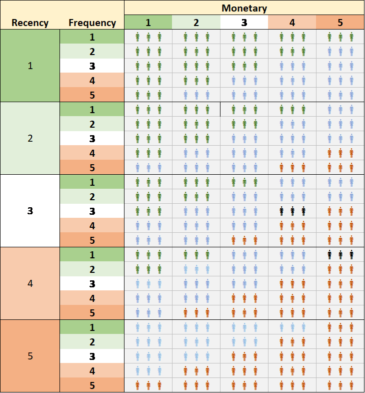
This means you can (for example) identify customers which are in high groups for frequency and monetary, but which haven’t bought recently – so this group could be targeted with personalised emails to encourage them to reconnect with the business. On the other hand customers which have bought recently and frequently but do not have high monetary value could be encouraged to trade up to higher value products.

Segmentation using Clustering techniques

RFM is undoubtedly a useful tool, but it doesn’t tell you anything about customers other than their value to your business, and it can’t help with other objectives such as designing targeted marketing campaigns.

This is where clustering techniques come in – these can draw on all types of data such as demographics, geographical location, time of purchase, which channel was used to purchase etc.

Clustering is used to find groups of observations that share similar characteristics, so you should end up with clusters where customers in the same cluster are more similar to each other than customers in a different cluster. The goal is to obtain customers in the same group as similar as possible, and customers in different groups as dissimilar as possible.

There are lots of different ways of clustering data. Some are highly complex and involve machine learning techniques which can be very opaque with businesses having little understanding of how the clusters were created. But the good news is that two of the most common clustering techniques are relatively simple and can be calculated using an add-in to Excel.

Hierarchical clustering starts off by treating each data point as a separate cluster and then starts merging the clusters which are most similar until all the data points are merged into a single cluster. The output is a diagram known as a “dendrogram” (from the Greek word dentro meaning tree), showing how the algorithm carried out its merging process.

In this example there are six data points – the ones which split closest to the bottom (C6 and C1, plus C2 and C5 in the diagram below) are the most similar to each other.
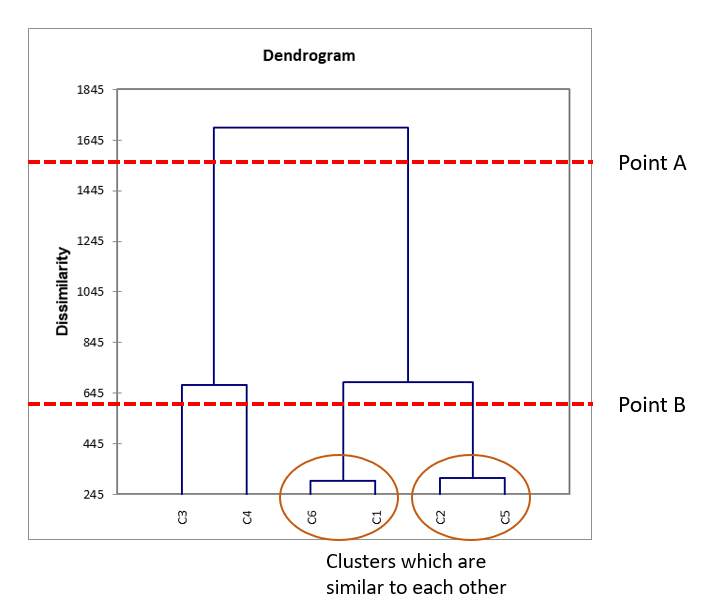
It’s up to the analyst to decide where to cut the branches, which determines how many clusters you end up with. In the chart below cutting the branches at Point A would give two clusters, cutting them at Point B would give 4 clusters and not cutting the branches at all would result in the six data points we started off with. In this case, because C6 and C1 are so similar, and C2 and C5 are also very similar, the decision would probably be taken to merge those data points and have at most four clusters in total.

K-means clustering starts off with the analyst deciding how many clusters they want to end up with (in the example below, five clusters have been chosen). An algorithm would then select five random points to act as the centre points of the clusters (a “centroid”), and assign each data point to the nearest centroid. It then makes several passes back through the data moving the centroids to make sure the distance between the points in each cluster is minimised.

The graph below shows the results of the clustering (each cluster has a different colour), but it only looks at two variables so the clustering is obvious. The power of K-means is that it could be used to find clusters using many different variables that a two dimensional graph could not capture.
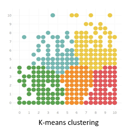
One of the disadvantages of K-means is that the analyst does not know in advance how many clusters the data should be divided into. In practice you usually have to have several goes at clustering with different numbers of starting clusters, plot the results on a graph and find what’s known as an “Elbow point” to make a final decision.

How to get the best out of clustering

Clustering is an open-ended technique. When you start off you have no idea what groupings you might find, and some of them may come as a complete surprise. So you need to start off with an open mind and be prepared to abandon pre-conceived ideas about your customers if the data shows they aren’t correct.

At the same time, you need to be clear about what you are ultimately trying to achieve. Are you trying to improve your marketing targeting? Or are you trying to change purchasing behaviour, or is there another metric you are interested in?
If your clusters are useful then you should start seeing patterns in the way that customers behave in relation to your chosen goal. So, for example, if your aim is to run differentiated marketing campaigns then you should see differences between the clusters in their response to marketing campaigns you have run in the past. Or if you want to increase frequency of purchase, you would want your clusters to have varying levels of frequency, so you could look at the characteristics of the low frequency clusters and therefore what might encourage them to buy more often.

Conclusion

Customer segmentation does not have to be a hugely expensive or complex process, and can often be carried out using data a business already holds. It is, however, an essential tool in understanding your customers and making sure that you don’t waste time and effort targeting the wrong people.

This graph shows that in fact there is very little relationship between a customer giving a high Customer Service score and giving a high NPS score. The R2 value is 0.001 meaning that only 0.1% of the changes in the NPS score can be attributed to changes in the Customer Service score.

When we look at the relationships between Speed and NPS, and Quality and NPS, the correlation is much stronger.


Get in touch

If you believe that evidence-based decision making is driven through collaboration between analysts and business managers then contact us to talk about how your business uses data, and find out whether there is a fit between your needs and the services Sensible Analytics can offer.
What is Big Data and why does it matter?

So what exactly is Big Data?

Everyone is talking about Big Data, and how it can transform our lives in areas as diverse as fighting crime to detecting brain tumours. But even though the term “Big Data” first emerged into public consciousness nearly ten years ago, there is still confusion about what it actually means, particularly in the business community. Only 37% of senior managers in medium sized companies said they would be confident about explaining the term to someone else.

So here’s a guide to Big Data and the background behind it.


Isn’t Big Data just large amounts of data?

In 1956, IBM launched the snappily named RAMAC 305 (RAMAC stood for “Random Access Method of Accounting and Control”). This was the world’s first commercial computer to contain a magnetic disk drive and could store up to 5MB of data – an astonishing amount of data storage at the time, but equivalent to one MP3 track today. Just over 60 years later, a very ordinary home or office computer could have the capacity to hold as 1 Terrabyte’s worth of data, giving it 200,000 times the storage capabilities of the RAMAC 305.

Without this dramatic increase in the ability to store information, Big Data could not exist. Over 2.5 quintillion bytes of data are created every single day. Over half the world’s population now has access to the internet; Google will process 3.5 billion searches every day, every minute of every day 156 million emails are sent. 90% of the data that has ever been created, was produced within the last two years.

The increase in the amount of data created will only accelerate - we are now seeing the advent of the Internet of Things, where devices in our houses, our cars and gadgets worn on our bodies can connect to each other and to the internet. These devices pump out a steady stream of data which can be analysed with the aim of increasing efficiency or generating alerts when action needs to be taken and which just adds to the data created directly by human beings.

Big Data, is indeed... big!

Different types of data

However, size isn’t the only thing that defines Big Data.

The first large datasets were gathered by governments, usually with the aim of working out how much tax they could collect. The Domesday Day book, completed in 1086 was an early example of this. Births and deaths were also recorded by governments and in the mid-19th century a doctor called John Snow carried out an analysis of death certificates during a cholera epidemic in London. Using an early data visualisation, he worked out that there was an unusually high number of deaths around a particular water pump in Broad Street, leading him to conclude that cholera was spread through contaminated water, which had not been known before. In the 20th century, companies started to collect large amounts of data about their transactions and customers; even before the official era of Big Data corporations such as banks and big retailers held huge amounts of data about customers and their interactions with the company.

But these were all relatively straightforward datasets, which were compiled by big institutions and mostly collecting numerical data. What has changed is the amount of data that is now being produced by individuals, particularly as a result of using social media. Every minute 456,000 tweets are sent, Instagram users post 46,740 photos, and there are 510,000 comments posted on Facebook and 400 hours of video are uploaded on YouTube. This content comes in a much wider variety of forms than the dry statistics and numbers which made up traditional datasets, including long-form text, images, audio and video.

Big Data therefore also encompasses the idea that data comes in a much wider variety of formats than it used to.

But what’s the point of all this data?

In 1965 Gordon Moore, the co-founder of Intel, made the observation that the number of transistors per square inch on integrated circuits had doubled every year since the integrated circuit was invented. This rather opaque statement (better known as Moore’s Law) basically means that the speed of computers is increasing at an exponential rate. The pace has now slowed down since Moore originally made this statement, but experts believe that data density will continue to double every 18 months until 2020-2025.
This is important because collecting large amounts of different types of data might be technologically impressive but doesn’t necessarily tell you anything interesting or useful. Getting insight out of the data requires analysing it, and analysing very large datasets takes a lot of processing power.

Of course for centuries, traditional statisticians have analysed large datasets to try and find correlations and patterns and most modern analytical techniques are based directly on statistical methods such as regression (which asks whether variables are correlated with each other).

But statisticians were often dealing with samples from a population, for example polling companies make inferences about what the whole country feels about an issue by analysing the responses a of few thousand people. The idea behind Big Data is that you no longer need to look at samples because you have access to data about the whole population, which can (as mentioned earlier) can come in a whole variety of different forms. To find all the patterns and correlations in these huge and complex datasets, you are going to need a machine. And to do it quickly you may well need a machine that can learn by itself.

Machine Learning – what is it?

Machine learning is a branch of Artificial Intelligence which aims to allow computers to learn automatically without human intervention. There are a couple of main types of machine learning.

Supervised machine learning algorithms are given a “training set” of data, for example if we wanted the algorithm to learn how to tell the difference between fraudulent and non-fraudulent credit card transactions apart we would give it a historical set of transactions which humans had pre-labelled as either being fraudulent and non-fraudulent. Then it would be let it loose on a dataset containing lots of other information about the customers and the transactions they made; what was purchased, where they were purchased, when they were purchased, what was bought with what etc. The algorithm would then try and work what sorts of things the legitimate transactions had in common and what distinguished them from the fraudulent ones.

Once the algorithm had established some rules to identify the differences, it would then be given a new set of transactions which didn’t have the answer pre-provided to see whether these rules work in real life. One of its rules might be that a transaction is probably fraudulent if someone suddenly buys a lot of ski equipment having never bought anything ski-related before, and having never even been to a country where skiing is popular. Once exposed to a real set of transactions it would flag these transactions as being suspicious, triggering a call to the credit card holder. But if most of these card holders confirmed that in fact, the transaction was legitimate that data would be fed back into the algorithm, and the computer might decide the that maybe this rule wasn’t that useful after all.

Unsupervised machine learning algorithms on the other hand, are used when the data is not pre-labelled. The aim of this kind of machine learning is not to figure out whether something is “right” or “wrong” but to explore the data and find hidden structures in it. Often this is used to group the data points into clusters or categories. For example, you could take all the comments on a business’ social media page as your dataset and then have the algorithm break them down into categories. You wouldn’t have any idea what categories the algorithm will come up with in advance, but the results may well help a business understand what kinds of things customers are saying about it without having to individually trawl through tens of thousands of comments.

Big Data defined

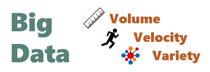
There are lots of short definitions of Big Data out there. But most of them revolve around the “three Vs” – volume, variety and velocity. Volume just means there’s a lot of data (as we looked at in the first section), Variety is the different types of data we now collect which we looked in the second section and Velocity refers to the speed of data processing that is necessary to get useful insights out of the data we have collected.

So does Big Data mean we can let computers make all the decisions?

Absolutely not!

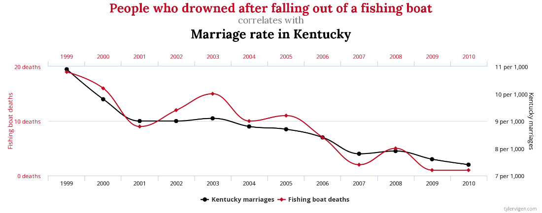
There are a number of very good reasons for this. Algorithms are very good at finding correlations between different variables – but that doesn’t mean that there is a causal link between them. For example between 1999 and 2010 there looks to be a very strong correlation between the number of people who drowned after falling out of a fishing boat and the marriage rate in the American state of Kentucky.

The odds of such a strong link between these two variables occurring purely by chance, are around 1 in 500,000 – a low enough figure for statisticians to assume that there must be a significant link between them. But of course falling out of a boat has nothing to do with marriage rates. An algorithm which is looking through literally millions of combinations of variables will inevitably find a small number of correlations which have occurred by accident. A human being could immediately spot these as being spurious but a machine by itself would not know this.

But even where a link between two variables makes sense, this doesn’t necessarily mean that this is a useful piece of information. Often statistical analysis simply reveals things that managers in a business already knew, a very obvious example would be a correlation between hot weather and rising ice cream sales. On the other hand, a relationship that is interesting and new might be uncovered, for example sales might be related to increases in government expenditure, but the business obviously has no power to change public spending. In both cases, consulting with managers who are the subject matter experts in their business, is essential to direct data analysis towards areas which can actually change the business for the better.

Machines are good at taking millions of “micro” decisions, e.g. whether a transaction is fraudulent or not, or whether an email should be classified as spam. But they cannot direct strategy in a business because they do not know about anything about the world outside the dataset it has been given to look at. They don’t necessarily know about the wider economic environment, about latest consumer trends, about your company’s values and culture, about changes in technology and all the other myriad pieces of information that humans pick up all the time without thinking about it.

Humans and machines working together

Big Data and data analytics are extraordinary technologies which help businesses and other organisations make better decisions - and those which fail to take advantage of these tools will find themselves falling behind. But in the end Big Data will never be big enough to replace the depth of knowledge and understanding that humans have about the world. In the end Businesses should neither be frightened that human managers will be completely replaced as decision-makers, nor believe that buying an expensive piece of new technology will solve all their decision-making problems without needing human expertise as well.


Get in touch

If you believe that evidence-based decision making is driven through collaboration between analysts and business managers then contact us to talk about how your business uses data, and find out whether there is a fit between your needs and the services Sensible Analytics can offer.

How Key Driver Analysis can help your business

A lot of businesses think that data analysis has to involve complicated algorithms that only highly-trained data scientists can understand. The truth is, you can use the data your business holds to add enormous value just by using some fairly simple statistical concepts and an Excel spreadsheet. This blog focuses on Key Driver Analysis.


What is Key Driver Analysis?

Key Driver Analysis helps businesses identify what is really driving their sales or their customer loyalty or any other metric which is important to business growth.

Often it is used to analyse customer satisfaction surveys to work out what is most important to customers, and therefore where the company needs to invest most of its time and attention.

If a business runs a customer satisfaction survey and gets low scores in one particular area, the obvious conclusion is that managers should immediately work on improving that score. But what if that particular metric doesn’t actually have much impact? Are there are other metrics which will have a greater effect on improving your business?

Introduction to Linear Regression

Key Driver Analysis relies on a statistical technique called linear regression. Regression tries to find out whether there is a relationship between two variables, and if there is a relationship, what that relationship is.

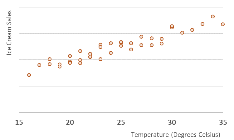
Imagine we want to look at sales from an ice cream van. This is a graph plotting the number of ice creams sold per day, against the average temperature on each day. Just from looking at the graph we can see there is a strong relationship between temperature and sales.

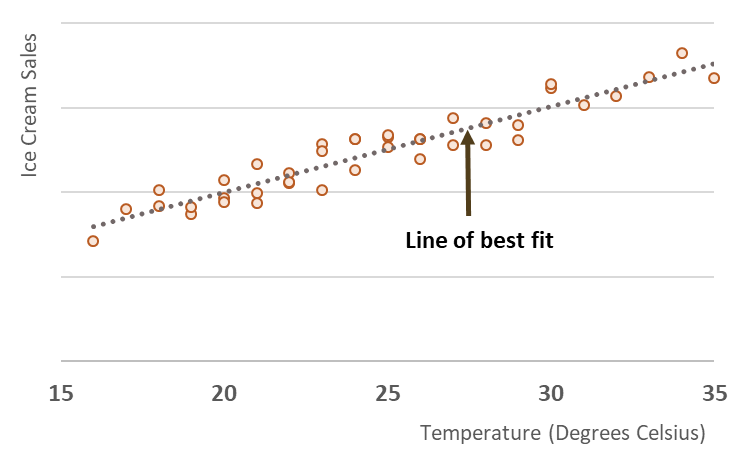
We can get Excel to draw a line (known as the “line of best fit”) through the middle of those data points, and automatically works out where the line should be by using the “least squares” method.

But even though there is obviously a strong link between ice cream sales and temperature, the weather doesn’t explain everything about how much ice cream is sold, because not every data point sits exactly on the line. There are several days where the temperature was exactly the same, but slightly different amounts of ice cream were sold. There could be lots of reasons for this – for example an unusually high sales day might be because an event going on nearby which meant that lots of people happened to be passing the ice cream van.

Excel can therefore also work out what percentage of the sales figure can be explained by the temperature and what percentage is explained by something else. This is known as the R2 value (R-squared) which in this case is 0.89, meaning that 89% of the ice cream sales figures are dependent on the temperature that day.

The other important task that Excel can carry out, is to work out exactly what the relationship is between sales and temperature expressed as a formula:

What this allows us to do is to predict the number of ice creams that will be sold, if we know what the temperature is that day. In this formula, x is the temperature and y is the predicted sales. If the temperature is 25 degrees, we would expect to see sales of (10.19 x 25) – 3.46. This comes to 251.

How do we use linear regression in Key Driver Analysis?

So let’s imagine we are looking at some data from a restaurant which runs a delivery service. They ask their customers to fill in a survey which asks to give a 1-10 rating score on how they found the Speed, Quality and Customer Service and then asks them to say how likely they would be to recommend the company (a Net Promoter Score or NPS) which is generally recognised as a key driver of growth. For this business the NPS is fairly low and the managers want to know what they should be focusing on in order to fix the problem.
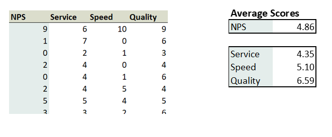
The raw data comes in a table like this, shown with the average scores for each question.

On the face of it, Customer Service scores the lowest and you could conclude that the company should concentrate on fixing this first. But let’s look at the relationships between each of these areas and the NPS score.

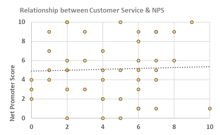
This graph shows that in fact there is very little relationship between a customer giving a high Customer Service score and giving a high NPS score. The R2 value is 0.001 meaning that only 0.1% of the changes in the NPS score can be attributed to changes in the Customer Service score.

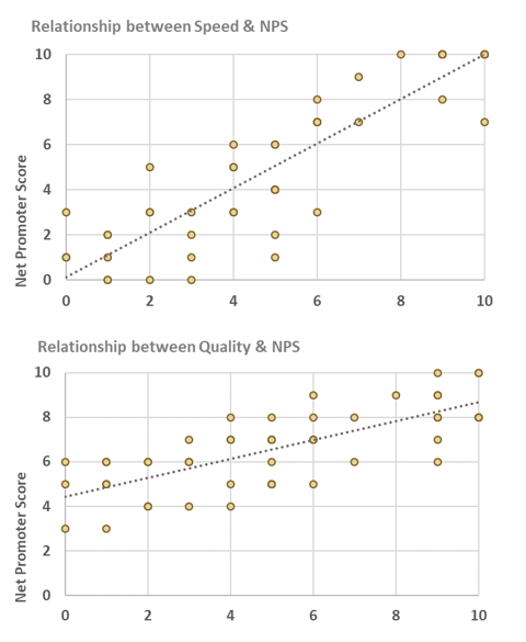
When we look at the relationships between Speed and NPS, and Quality and NPS, the correlation is much stronger.

But out of the two scores what is the most important area to focus on? To work this out we need to look at the equations for the line of best fit.

Speed
Quality

The numbers highlighted in red (known as the beta value) determine the slope of the line. The higher the number, the steeper the slope and we can visually see that the Speed graph has a steeper slope than the Quality graph.

A steep slope means that changing the score in this area will have a big impact. For every one point increase in the Speed score, the NPS score increases by 0.98. But a one point increase in Quality only leads to an NPS increase of 0.42. So this suggests that the very first priority for this business should be to get the Speed of its deliveries up as this will have the greatest impact on its NPS score.

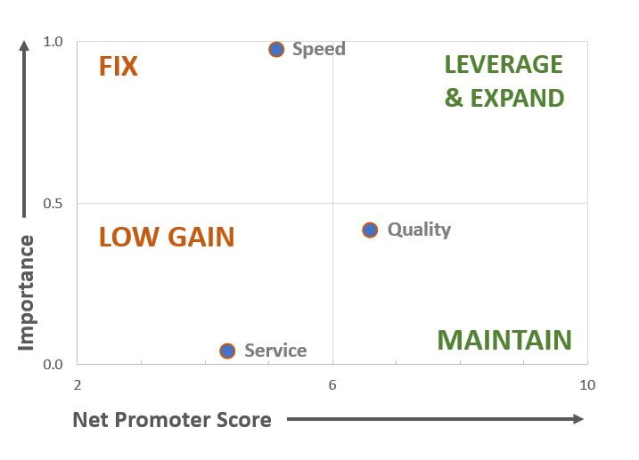
We can map the values in a matrix showing what action needs to be taken.

For scores which are low and which are important, it is clearly a priority to fix them as soon as possible, but scores which are low and which are less important, have lower gains associated with them. High scores with high importance can be expanded to gain greater traction with customers, but there is little point in investing in areas which already have high scores but which are not influencing customer outcomes.

Key Driver Analysis can be used to look at a wide variety of metrics

Key Driver Analysis can be used in all sorts of ways – for example to assess what factors drive a propensity to buy a product, or to understand what factors cause customers to have a positive or a negative impression of your brand. Another common use is to look at what drives “usability”, where customers fill in a questionnaire about how easy a product or app is to use.

This technique could potentially be used to find the key drivers behind any number your business is interested in. For example if you have granular level customer data you might want to use survey data in conjunction with actual sales figures and work out which aspect of your business was driving customers to purchase more. If you have demographic data for your customers such as age, income or gender you could find out whether these were related to sales levels.  The data doesn’t even necessarily have to relate to individual customers if you have a chain of stores you could work out what was the principle driver of sales in those stores – size, range or customer satisfaction scores.

Pitfalls in using regression

However, there are a number of watch outs when using linear regression techniques.

One is that regression simply establishes correlation rather than causation. In the ice cream example, we could plot the sales of ice creams against the sales of sun hats and would probably find a strong link. But that doesn’t mean that if you invested in encouraging more people to buy ice creams then you would see the sales of sun hats increase – the actual causal link is that on hot days people are more likely to buy both items.

There are other situations where two variables are closely linked, known as “multicollinearity” – for example if a survey asks two very similar questions such as “Were the staff friendly?” and “Were the staff helpful?” This can lead to difficulty in interpreting the model, but it can be dealt by further analysing the data and taking the least important variable out.

Another problem is that quite strong correlations can be thrown up between two variables, purely by chance. This is a particular problem with machine learning algorithms which trawl through large data sets trying to find links between different fields – see my blog on Big Data for more about this issue.

As with all data analysis the way to avoid problems is to plan properly in advance with input from both the person doing the analysis (who can for example advise on how to structure a survey to avoid multicollinearity problems) and managers who understand the business well, and who will know which correlations are useful and which ones are not.

Overall, when used properly Key Driver Analysis is an extremely useful tool in identifying which areas a business should invest in, and one which doesn’t rely on complicated and expensive analytics. For more ideas about how to use statistical analysis to help your business click here.


Get in touch

If you believe that evidence-based decision making is driven through collaboration between analysts and business managers then contact us to talk about how your business uses data, and find out whether there is a fit between your needs and the services Sensible Analytics can offer.