
DESIGN
Why visualise data?
Humans are naturally visual creatures. Rows and rows of data are hard for us to process, and sometimes patterns in the data can only be identified by visualising the data.
The aim of any visualisation is to present the insights derived from data as clearly as possible and reduce the amount of work that the audience has to go through in order to understand the conclusions. If the desicion-makers in the audience are struggling to grasp what the data is saying, they will lose interest or reach the wrong conclusions, and all the effort and cost of analysising and interpreting the data will be lost.
There are two main types of visualisation static and exploratory. An exploratory visualisation allows a user to search for their own insights in the data. A static visualisation presents conclusions that an analyst has already drawn - although a static visualisation can also have dynamic elements.
Whether you need to create a single dashboard or presentation, or whether you want to develop a totally new design to communicate all your company's data, Sensible Analytics can help.
See my portfolio for examples visualisations I have created:
PORTFOLIO
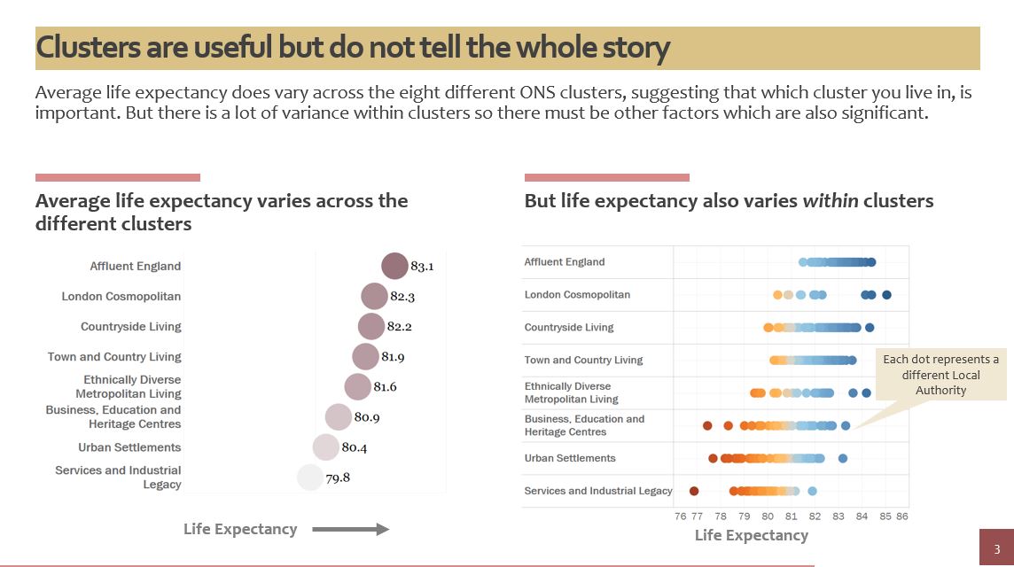
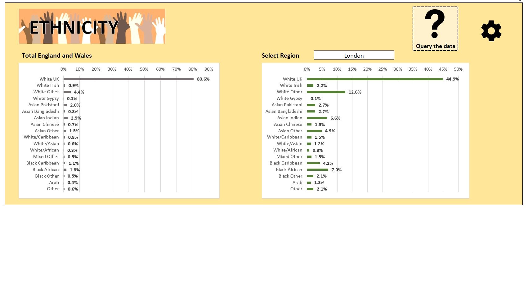
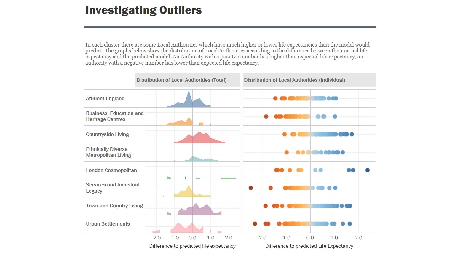
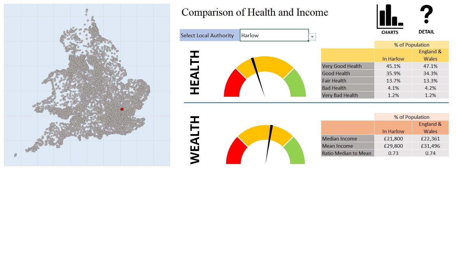
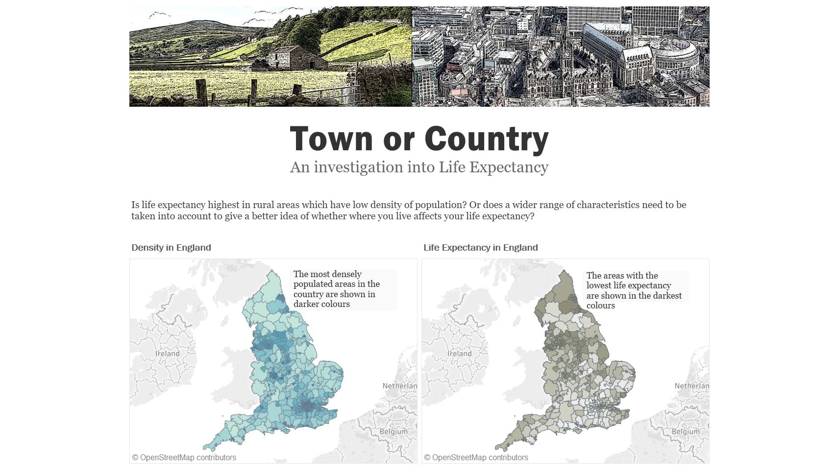
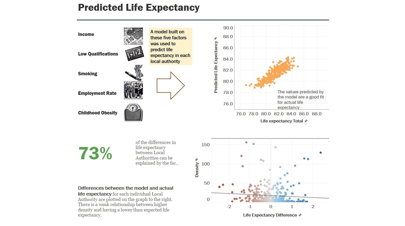
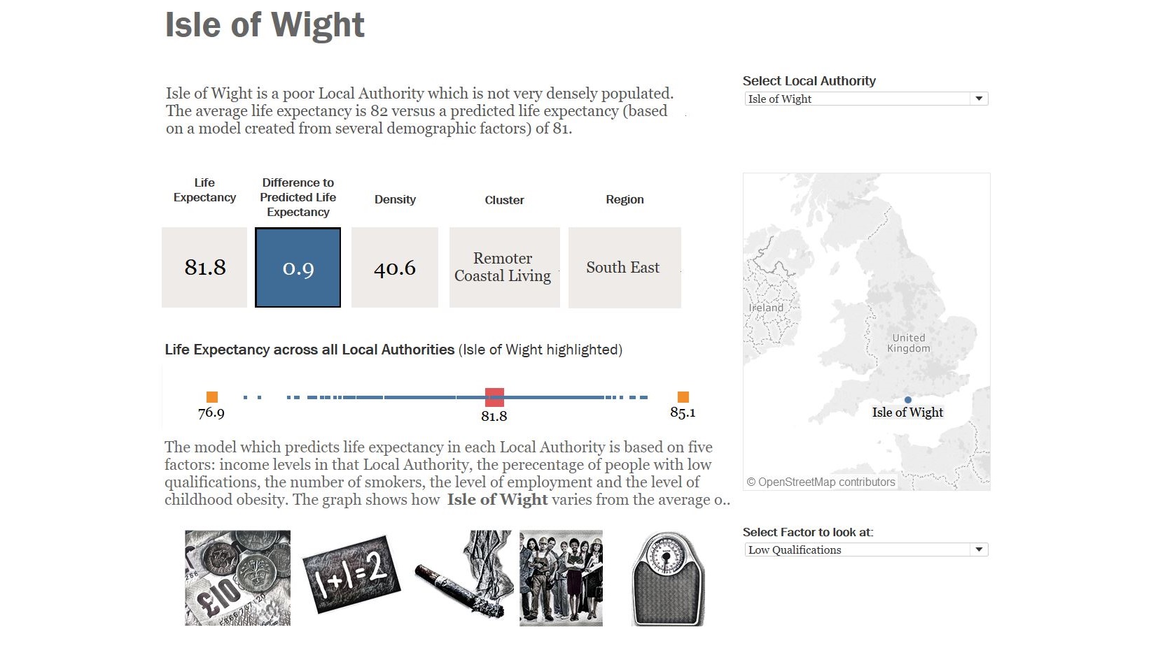
Examples of my work, including Tableau dashboards which use multiple regression to build a predictive model, data-driven Powerpoint presentations and dashboards created only using Excel. The underlying data in these examples come from public sources.

CONTACT ME
Visualising data effectively is the important last step in ensuring that the insights derived from data are communicated to decision-makers. Please get in touch for a chat.