Portfolio
Below are examples of my analytical work, data visualisations, dashboards and data-driven presentations. To ensure confidentiality, all the data used is from publicly available sources, but the techniques used could equally be applied to commercial data.
Click on any of the images to see the workbook or presentation.

TABLEAU DASHBOARD - GENERAL ELECTION
This is a dashboard I created for the 2019 General Election showing past election results for each constituency together with demographic data about each seat and an interactive model of the results based on user-inputted swings.
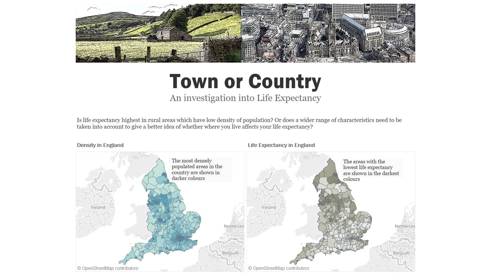
TABLEAU EXPLORATORY DASHBOARD
This is a workbook I created in Tableau which looks at different factors which may contribute to life expectancy with a view to building a predictive model. The data used here is publicly available, but the same techniques could be used to build a model predicting sales or transactions in a business setting.
PREDICTING LIFE EXPECTANCY
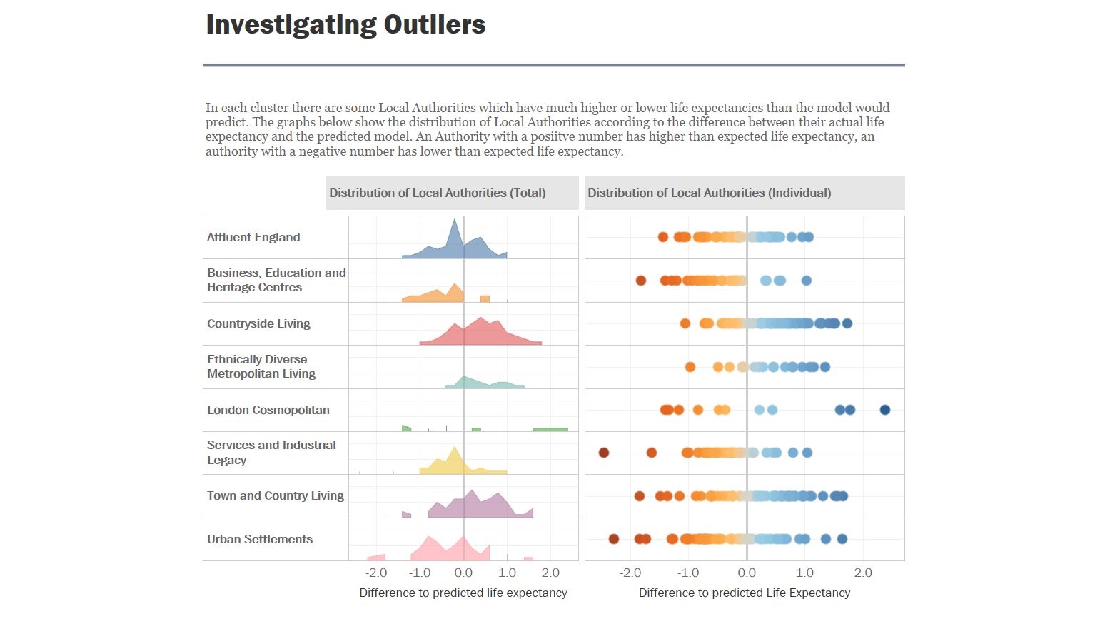
These dashboards build on the previous exploratory workbook, which looked at the different factors contributing to life expectancy and built a predictive model. These dashboards look at the results of the model and highlight the outliers.

A SUMMARY DASHBOARD IN TABLEAU
This dashboard builds on the previous two Tableau workbooks It allows users to see the detail on each Local Authority in England and understand the particular factors which might drive life expectancy in each area.

A DASHBOARD IN EXCEL
This is an example of how you can make attractive dashboards in Excel, without the need for any other software. This dashboard looks at the relationship between Health and Income in English Local Authorities, with navigation controlled by macros

DASHBOARD IN EXCEL USING MACROS
This is an exploration of where different ethnic minorities live in the UK. The data behind this dashboard goes down to a very detailed level, so forms driven by macros help the user get to the level of data they want to see.
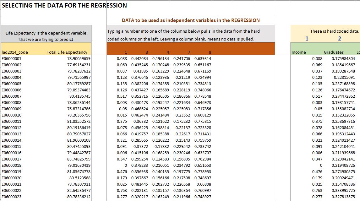
STATISTICAL ANALYSIS IN EXCEL
This workbook shows the creation of a model based on multiple regression analysis. It starts with preparing the data so that it is in the right format, then performing several regression analyses to determine the right variables to put into the model, and finally comparing the model with actual data. This model was used in the Tableau visualisations above.

A DATA DRIVEN POWERPOINT PRESENTATION
An example of a data-heavy presentation. I designed the presentation to make communicating the insights as effortless as possible to a non-technical audience.